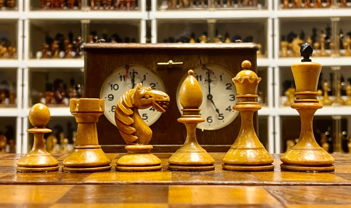
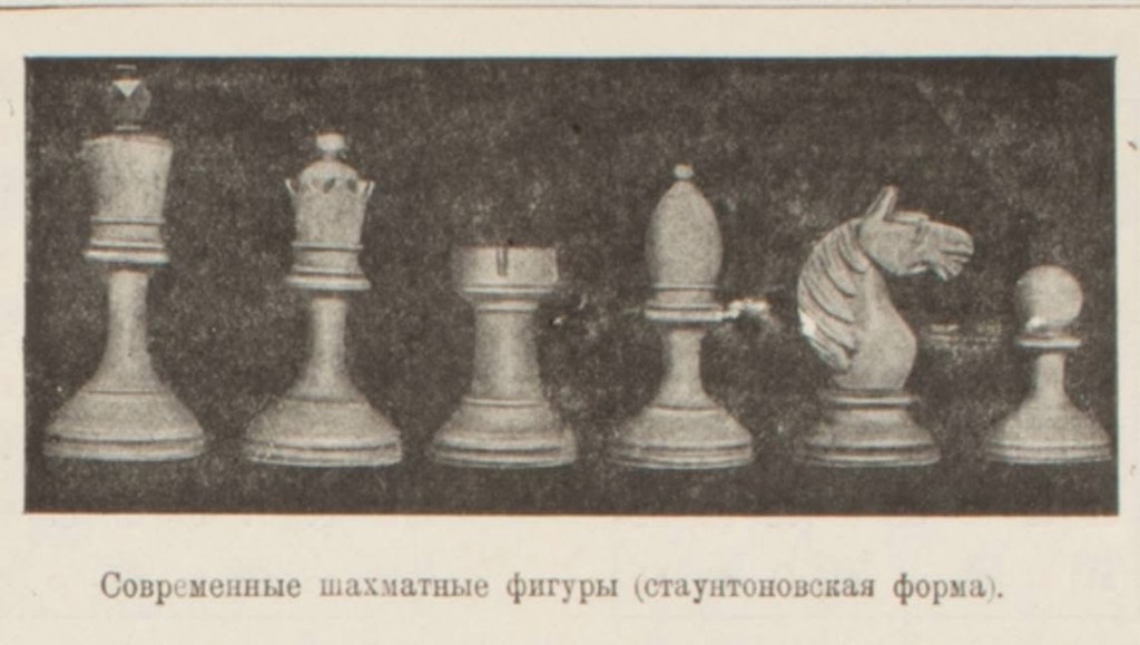
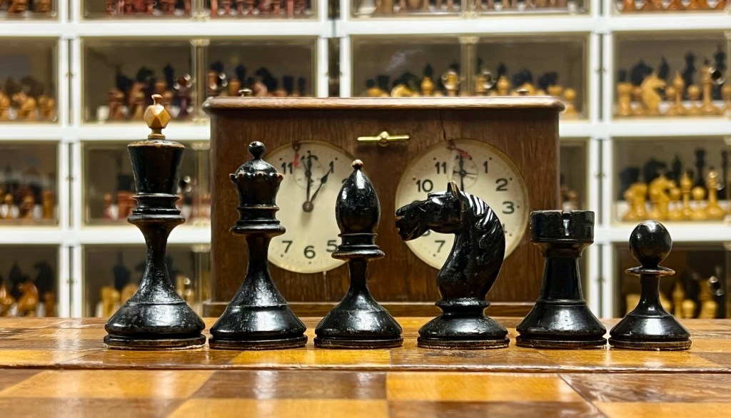
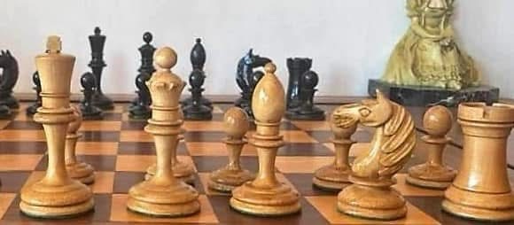
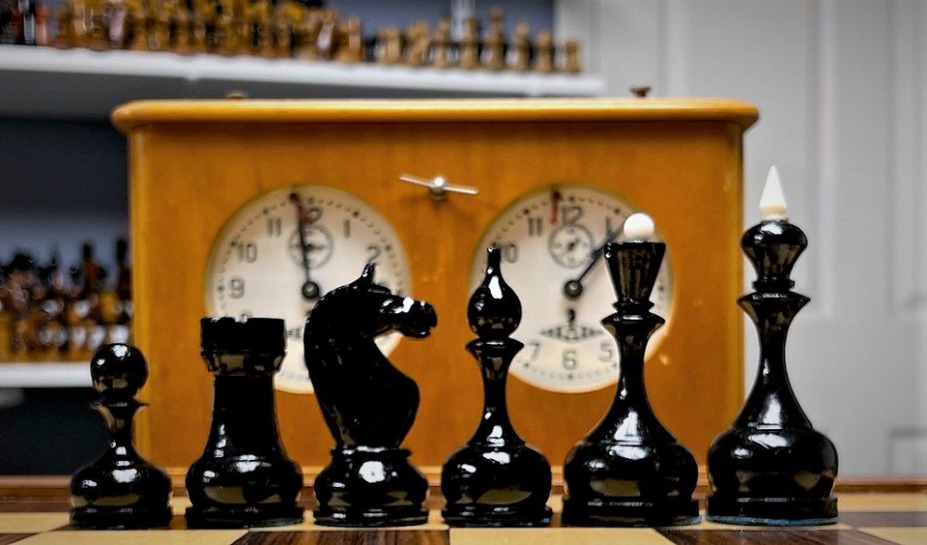
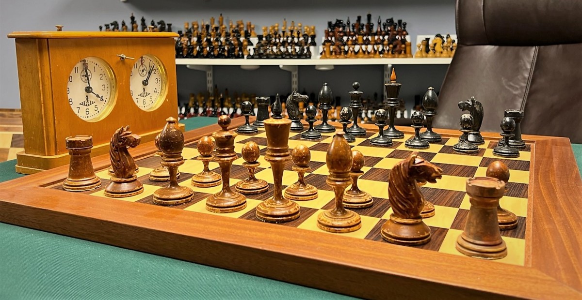
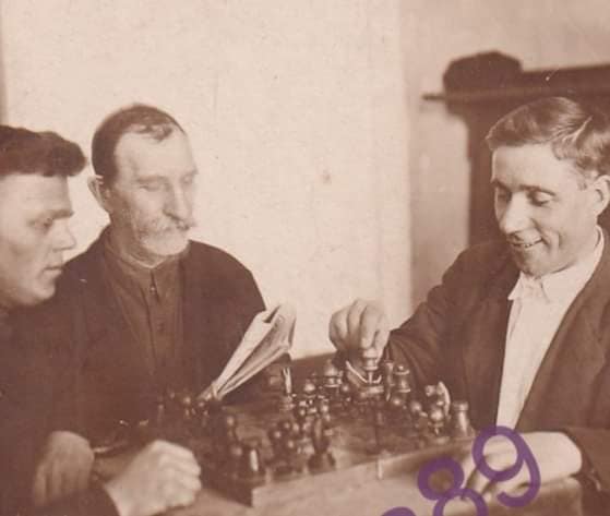
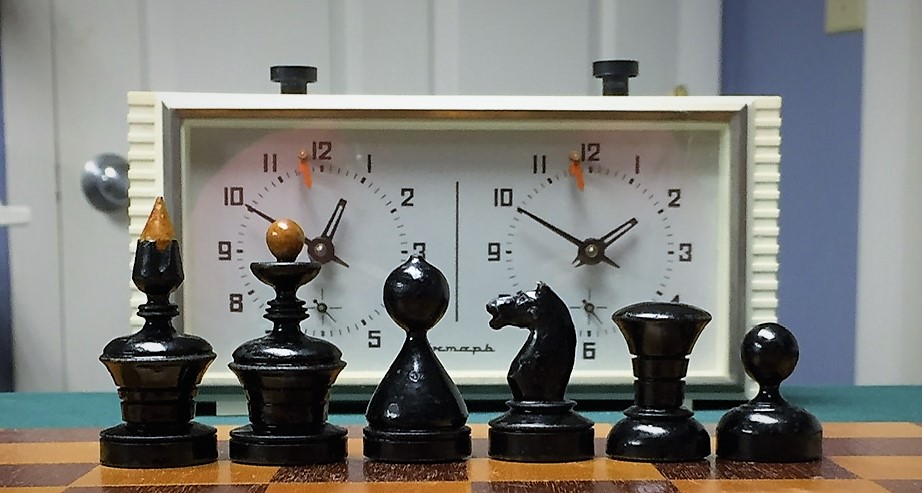
Soviet Master Ilyan Maizelis included a photo of the pictured set in his famous primer “Chess Beginnings” (1937). There he described it as “Modern Chess Figures (Staunton form).” At 9. So the set dates no later than 1937. For sake of convenience, I’ll refer to it as “Maizelis’s Set,” though I have no other evidence that he actually owned or played with one like it.
Photo courtesy of Sergey Kovalenko.Photo courtesy of Sergey Kovalenko.
I recently added such a set to my Soviet and Tsarist collection.
The set is magnificently turned, carved finished, and weighted, with several small defects, a couple chipped coronet tips, broken finials on a White Bishop, a partially broken off finial on the White King, a few cracks and worn finish for character.
Chuck Grau photos.
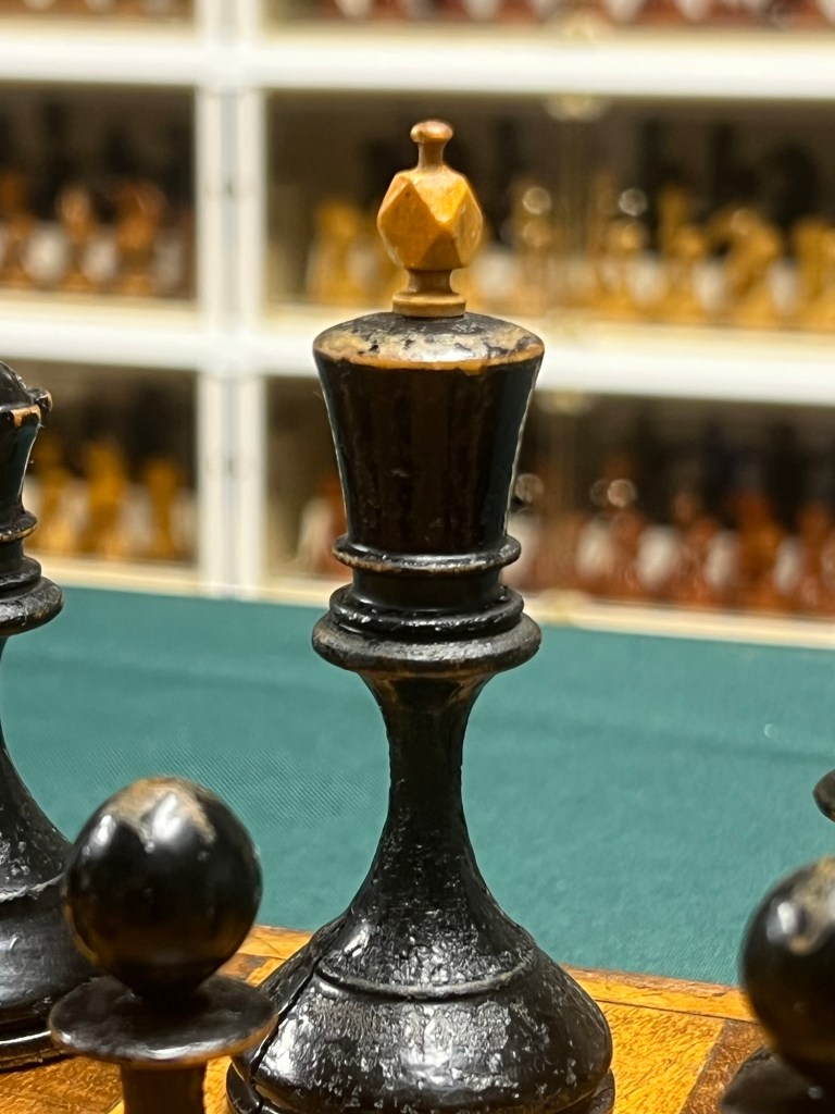
The Black King measures 97 mm with its fully intact finial. The Kings’s finials are carved in a unique diamond pattern. The Black pieces are painted with age-consistent wear and chipping, but the White pieces have a finish approximating French polish akin to two Tsarist sets that have matriculated through my collection. Beautiful patina.
Diamond-shaped finial. Chuck Grau photo.
The Knight carving is spectacular, the best of any of my Soviet sets and even better than my best Tsarist ones. Highly detailed mane carvings on both sides of the torso. Crisp mouth and eye details. Just spectacular.
Chuck Grau Photo.
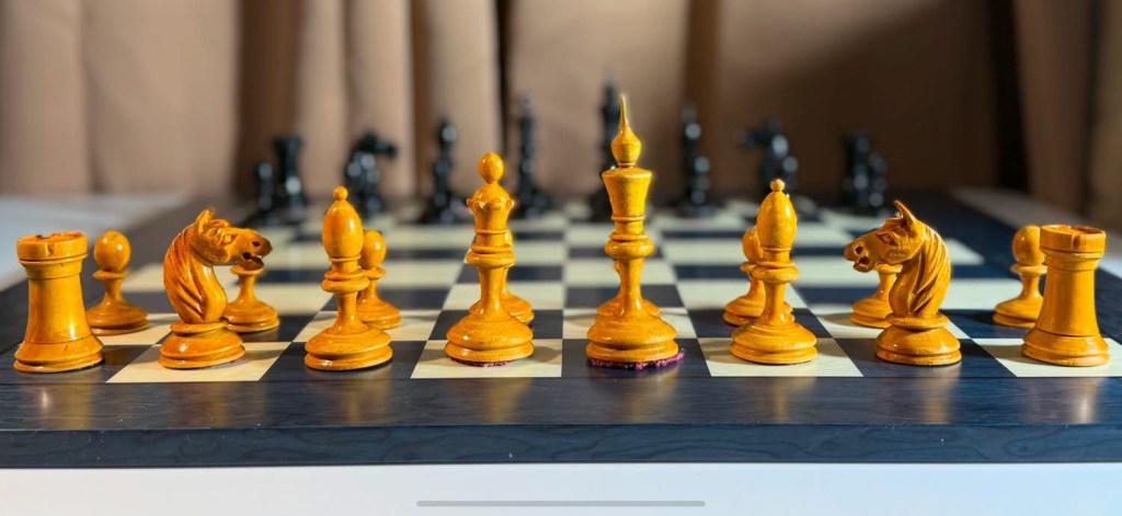
The style is of the group of sets commonly but not unreasonably mistaken for the 1933 Botvinnik Flohr match. I included pictures of several of these sets in my article on the 1933 set.
Antonio Fabiano Collection, photo.Stephen Kong Collection, photo.Murat Dzhemakulov Collection.
Shane Chateauneuf recently acquired a beautiful, related set.
Shane Chateauneuf Collection, photo.
The board accompanying my set is wonderful in its own right. Beautiful veneer worn consistent with its age. Gorgeous patina. 53 mm squares are perfectly sized for the pieces, very un-Soviet. None of the asphyxiation that Arlindo Vieira repeatedly complained of. This is perhaps another factor hinting that the set may be much older than 1937.
Chuck Grau photo.
Simply a gem.
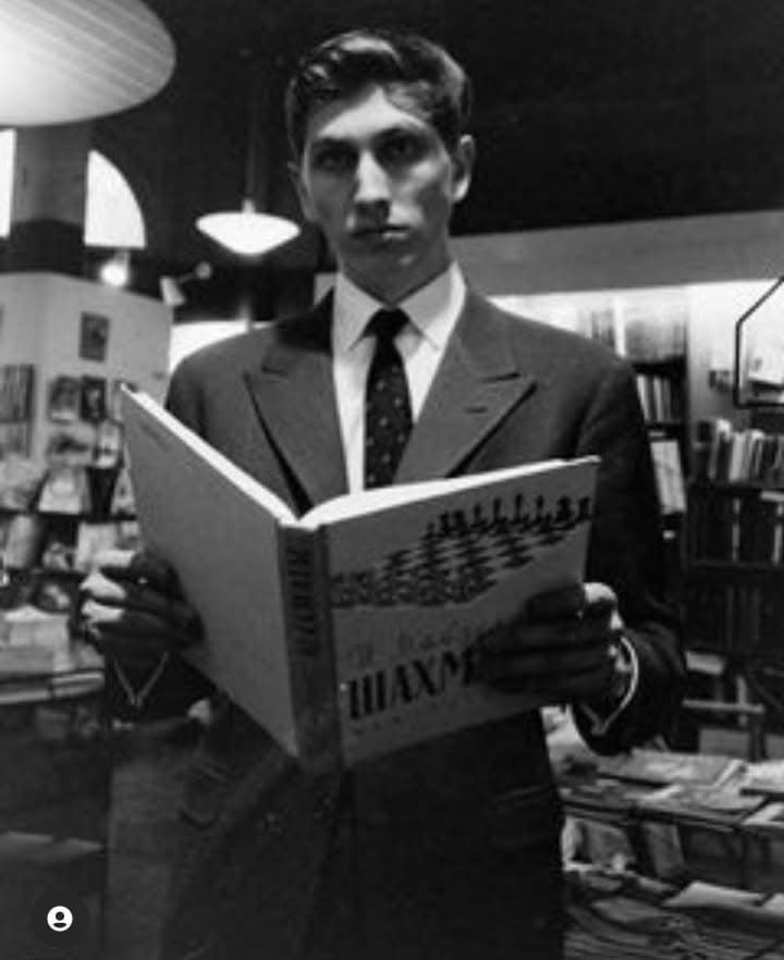
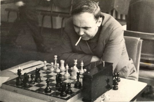
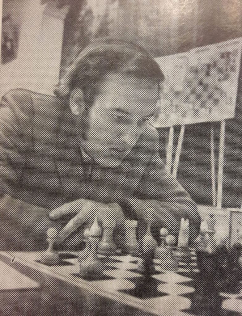
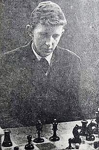
Ilyan Lvovich Maizelis
Ilya Lvovich Maizelis
A close friend of Yuri Averbakh, Maizelis was a noted teacher and author, even outside the Soviet Union. No less than Bobby Fischer studied his work.
Courtesy of Jorge Njegovic Drndak
Soviet chess historian Jorge Njegovic Drndak has compiled this brief biography:
Ilya Lvovich Maizelis (1894-1978)
He was born on December 28, 1894 in Uman, a small village in the Cherkasy region. Having passed college in Ukraine, Ilya won the Union-wide Tournament of Cities in 1924 (a parallel tournament). Once in Moscow, Maizelis quickly joined the chess movement and became one of its most prominent figures.
Having started working as a chess journalist, Maizelis covered the Alekhine-Teichmann match (Berlin, 1921), at that time Alexander Alexandrovich’s name was not yet animated in his homeland. Ended with a score of 3:3.
Ilya Maizelis was close friends with Emanuel Lasker. It was he who during the Moscow International Tournament (1925) handed the great thinker a telegram saying that the work of the second world champion would be staged. The played Lasker ended up getting the foot of the “mill” in the match against Torre, but consoled the young man, who at first considered himself responsible for this defeat of the great chess player.
Maizelis was one of those who convinced Emanuel to move to the USSR, take Soviet citizenship and train for the national team. Shortly before leaving for America, Lasker handed the journalist the manuscript of his children’s book. Ilya’s friend Alexander Ilyin-Zhenevsky believed it was Maizelis’ duty to publish the book, but the work “How Victor Became a Chess Master” was only published in the 1970s.
Ilya Maizelis is a member of the editorial board of the magazine “64”. “Checkers and Chess in a Workers’ Club” (1925-1930), executive secretary of the publication “Soviet Chess Chronicle” (1943-1946), published in English in Moscow under the auspices of the Union Society for Cultural Relations (VOKS). He trained at the Pioneers House of the capital, but at the same time, until the late 1930s, he did not stop the practical performances, performed regularly at the finals of the Moscow championships. In 1932, Ilya Lvovich took fourth place in the championship of the capital and, of course, played in the strength of the master, but did not officially fulfill the title, opting for journalism.
Author of the books “Beginner Chess Player”, “Chess Yearbook 1937-1938”, “Fundamentals of Opening Strategy”, “For 4th Chess Players”. a and 3. “under category”, “Selected games of Soviet and International Tournaments of 1946”, “Chess Textbook Games”, “Tower vs Pawns”, “On the Theory of Tower End”, “Chess Finals. Pawns, Bishops, Horses” edited by Y. Averbakh, “chess. Fundamentals of Theory. Ilya Maizelis translated from German the books “Endgame Theory and Practice” by Johann Berger and “My System” by Aron Nimzowitsch.
With his article, he was the first in the USSR to draw attention to the 1603 painting “Ben Johnson and William Shakespeare,” attributed to Karel van Mander and depicts 17th-century English playwright playing chess. Ilya Lvovich studied the works of the poets Henry Longfellow and Heinrich Hein, translated their works into English and German.
Ilya Maizelis has compiled a chess library that is widely known not only in Moscow and the USSR, but also abroad.
“Everyone knows that Maizelis had the best chess library in Moscow and was often asked to clear up something from an old magazine or a rare book. There was a phone in the room and Ilya Lvovich used to dictate chess and variation games for a long time. Maizelis’ mother-in-law was always in the room, paralyzed and completely indifferent to everything that was going on. He sat like an idol and stared at one point.. And Maizelis, dictating movements, did not say “a-be”, like everyone else, but in a low voice – “a-be”. And then, one day, the mother-in-law, who was apparently tired of this hug to hell, said sadly, “Abe, abe… Fucking idiots! ” (J. Neishstadt).
Shortly before his death, Ilya Lvovich sold the library to good hands to preserve it for posterity. The master of Russian chess journalism passed away on December 23, 1978 in Moscow.
A wonderful essay authored by Alan Power, master of artistic chess set restoration and owner of the Chess Schach. Please click the link to read Alan’s highly informative article.
“For a reader living in the free world the word “thief” perhaps sounds like a reproach? But you misunderstand the term. In the underworld of the …
We often see a particular style of Soviet set described as “Latvian” and as “Tal’s favorite.” Although neither claim is supported by the current state of research, both contribute to ongoing misunderstanding of the set’s origin and significance.
According to Merriam-Webster.com, an Urban Legend is anoften lurid story or anecdote that is based on hearsay and widely circulated as true. While there no doubt are lurid details about the life and times of Mikhail Tal, none are known to be associated with these pieces.
Title Page to Arlindo Vieira, Chess Sets–Russian Soviet (2012).
Both claims originate from slides appearing in Arlindo Vieira’s seminal 2012 video on Soviet and Russian chess sets and associated test in his blog Xadrez Memoria. The set appearing in the banner is the one from his collection that he claims to be Latvian. The claim that the set is Latvian arises from a slide in which Arlindo proclaims that “I call this set Latvian” and the other from a slide in which he declares that “He [Tal] loved these pieces!” The first claim rests on a questionable inference; and the basis for collectors repeating either claim is little more than hearsay.
Urban Legend 1: “These Pieces Are Latvian”
Here is the slide that collectors are ultimately relying upon when they claim that sets like Vieira’s are Latvian.
Vieira 2012 Video.
When collectors and dealers claim pieces like these are “Latvian,” they are knowingly or unwittingly referring to this slide, rather than first hand information or research actually linking the sets to Latvia. They are repeating Arlindo’s designation for the truth of the matter asserted–that they’re Latvian– making the statement relied upon hearsay.
A more defensible claim might be: “I believe this set to be Latvian and I am relying on Arlindo’s expert opinion in doing so.” If we consider Arlindo as an expert witness, as I do, we are entitled to inquire into the basis of his opinion. He lays that out in this very slide–the set was popular in Latvia, as evidenced by the many photos he found of like sets being used in Latvian events. His conclusion that the set is Latvian rests on the proposition that a set’s place of origin can be inferred from the frequency with which we find photos of players using it there. As he explains in his blog, Xadrez Memoria:
I have noticed through photos that certain games were used more frequently in the former Baltic Republics, and less, much less in tournaments in the capital or Leningrad, just to give an example. This is the case with these pieces of mine, which curiously appear in dozens and dozens of photos related to Latvian schools, tournaments and players. In fact, curiosity or not, even today at Ebay auctions, when these pieces appear, the sellers are mostly from Latvia, just like the one who sold me the pieces shown here.
On its face, this seems fairly reasonable, but the more we parse it, the less reasonable it becomes. If frequency of appearance in photos and Ebay auctions implies place of origin, what happens when photos of sets used in different venues appear? Or more sets are sold by vendors in Ukraine? The most reasonable response would be to say that the set more likely comes from the place from which the most photos and sales of it arise. We have no idea of how representative his photos and Ebay vendors are. What if, notwithstanding the photos Arlindo examined, more of the sets actually were used in Moscow. Does that make it a Moscow set? Or perhaps there actually are more photos of the set being used in Leningrad, which he missed in his review? Is it now a Leningrad set? My point is that it is not inherently reasonable to definitively infer the origin of the set from a handful of photos without considering how representative the photos are of all photos of Soviet sets in all locations. We just don’t know from the evidence presented in Arlindo’s video and website. But I think it’s fair to say that since 2012, we have examined more photos of Soviet sets in use than Arlindo did or could access back then.
I think the best way to understand Arlindo’s statement “I called this set Latvian!” is as an hypothesis, rather than a firm conclusion. He called it “Latvian” based on photos and Ebay listings he found. It’s reasonable to form an hypothesis based on such limited research. But like every other hypothesis, its validity is subject to being tested by the collection and analysis.
Since 2012, a great deal of data has been uncovered that overwhelmingly indicate that sets of this basic design were made in many places, but not one of them is Latvia. We find evidence of them having been made in a children’s penal colony in Siberia, in Gulags in Mordovia, artels in Khalturin and Ivanovo, and in state factories in Ivanovo and Semenov. We owe a debt of gratitude to Vladimir Volkhov for his research into the sources of production, reported in his wonderful blog, Retrorussia. And this evidence consists of much more direct evidence than photos of use. It comprises stamps and labels identifying places of origin on and in the boxes containing the actual pieces. This is hard evidence, allowing far stronger inferences than could be made in 2012 in the absence of such a rich record.
This all, of course, begs the question as to what these sets should be called. Vladimir’s solution is to adopt Russian collectors’ practice of naming sets by where they were made. So sets made in Mordovia would be called Mordovian; those in Khalturin, Khalturiskie; those in Semenov, Semenovskie; those in Ivanovo, Ob’edovskie, for the village in Ivanovo Region where the production facilities were located. I think this is a very important part of the naming solution. It incorporates and honors local practice, and ties sets to locations where they actually originated.
But I have two problems with adopting this convention as a total resolution to the naming issue. The first is that it completely ignores the important issue of style. It cannot be disputed that the “Latvian” sets from Berezovsky, Mordovia, Khalturin, Semenov, and Ivanovo are the same general style. That is an important observation, as it indicates design notions and practices transcended localities and regions, and ignoring it leaves important chapters of the story unwritten.
The second problem is that the location convention creates as much confusion as it eliminates. Take the Khalturin example. Many different styles of chess pieces were manufactured there. Under the location convention all of them would bear the same name, and we never could distinguish one from the other in writing without attaching a picture to clarify which one we were talking about. I find that unacceptable.
Everyday pieces from Artel in Ivanovo Region. Images posted by John Moyes in SK, 9 August 2022.
Ultimately, we need to accept a naming convention that recognizes both style and place of manufacture. And I would include a date, because pieces made in the same style in the same place could vary over time in some significant details. But, then, what should we call this not very Latvian design? I would be comfortable calling the style Berezovsky, in homage to the children of the Gulag who apparently first made them. I also would be comfortable calling them Everyday, in accordance with the category John Moyes found on the label of a set from Ivanov. I like two things about this option. First, it is homage to the Soviet practice of calling consumer items, including sets, by the category of intended use. Second, sets in this style were ubiquitous, truly the everyday sets of many Soviet households. Until we reach some consensus on this, I probably will continue to call the style Mordovian, as I find it the most beautiful iteration of this venerable style.
Urban Legend 2: “Tal’s Favorite Set!”
This one is a real whopper.
“Tal’s favorite set.” Mein Gott im Himmel, how do you know that?
I’ve never seen a collector or dealer asserting this claim to state his or her basis for making it, myself included. One hypothetically might have first hand knowledge: “I knew Tal, and Tal told me it was his favorite set”; or “I watched Tal play and every time he chose the set he chose this one”; or “I listened to Tal give an interview to a Filipino Grandmaster and he said it was his favorite set and that he was the victim of vast international conspiracies.” Wait, that was Fischer. Or, “I read such and such by Tal and he wrote that it was his favorite set.” Or one might have evidence from which one might infer it was his favorite, like multiple photos of Tal using the set in his residence or hotel rooms, or sitting over his mantle or displayed on a shelf.
But no, “Tal’s favorite!” is the claim, without further evidence, only a wink and a nod as if to say the claimant has some special inside information and insight into the Magician of Riga, or belongs to an exclusive club of those who do. I’ve done it myself. Hogwash.
All these claims of special insight into the predilections of one of the world’s most popular champions arise from a single slide in Arlindo’s 2012 video, which his blog does not elaborate:
Vieira 2012 video.
Arlindo’s slide doesn’t even SAY it was “Tal’s favorite.” We all leapt to that specious conclusion ourselves. I’d now characterize Arlindo’s statement as an excited utterance, expressing joy that the pieces could be connected to the charismatic Tal. But it’s not credible evidence that the set was “Tal’s favorite.” All us cognoscenti who imply we have have inside information about Tal’s preferred set, we need to present our evidence, or we need to stop repeating a baseless claim.
The 1930s saw an explosion in the production of Soviet chess sets and in the creativity of their designs. While very simplified designs began to be produced in Gulag workshops worked by largely unskilled prisoners to meet the demands of the Soviet State’s program of bringing chess and culture to the masses, smaller cooperatives of skilled artisans known as Artels threw off the yoke of the Staunton design and began incorporating Modernist and Constructivist elements into their designs.
Artel Kultsport
Artels were collectives of handicraft-producing artisans, originating in Tsarist times yet expressly recognized by Soviet law, which produced consumer goods and handicrafts. These artisans labored in a commonly owned workshop with commonly owned tools, and their products belonged to the cooperative. They organized their own production efforts and shared costs and revenues.
Artels saw a dramatic expansion during the late twenties and thirties, but an equally dramatic reduction in numbers during World War II. By 1960, all the remaining Artels had been converted to state factories. G. Phillips, Handicrafts in the Soviet Union, 14 JOURNAL OF THE INTERNATIONAL AFRICAN INSTITUTE NO. 4 209 (Oct. 1943); F. Leedy, Producers’ Cooperatives in the Soviet Union, 80 MONTHLY LABOR REVIEW 1064 (No. 9, Sept. 1957).
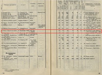
Foremost among the chess-producing cooperatives was Artel Kultsport, located in Moscow. Artel Kultsport produced chess pieces, chess boards, chess tables, checker sets, and other sports-related items. This “advertisement” from the 1930s lists the artel’s product line and lists its Moscow address. Ironically, the graphic designer does not appear to have been a chess player!
Here are two pages from the 1936 Moscow Directory recoding the production of 34,359 chess boards by Kultsport, uncovered by the excellent research of St. Petersburg collector Sergey Kovalenko into the history of Soviet chess-manufacturing entities.
Source: Sergey Kovalenko
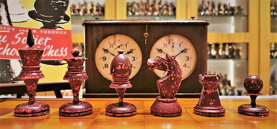
The Ferocious Knight Set
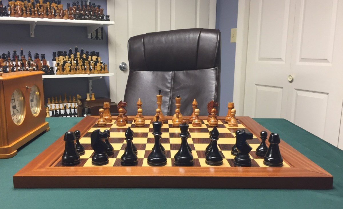
Among the most beautiful of the sets Artel Kultsport produced was this tournament set, whose pieces are weighted and whose kings are 100 mm tall.
Chuck Grau Collection, photo.
The beautiful red-toned box/board contains a partial paper label linking the set to Artel Kultsport.
Chuck Grau Collection, photo.
The set is finished with the caramel-colored varnish typical of the 1930s, and is well-scarred by cigarette ash. Some of the pieces, even a rook, exhibit warping, a very uncommon affliction in Soviet sets.
The pieces of the set retain some Staunton elements. The pieces’ relative proportions reproduce the column and pediment structure analyzed by architect and chess set designer Dan Weil. The Queen wears a coronet and the rooks turret bears merlons.
Chuck Grau Collection, photo.
At the same time, the set dispenses with the Staunton’s “triple collar.” It also replaces the King’s cross with a spiked finial, a practice that Isaak Linder documented goes back to ancient Rus. Linder, The Art of Chess Pieces (Eng. ed. 2002). The Bishop’s miter resembles the onion tops of Orthodox churches. In addition to the traditionally Russian elements, the set-identifying elements of the pieces–their bases, stems, and pedestals–form a continuous geometric curve that reflects Modernist and Constructivist influences and resides at the core of Soviet design. The rooks tubular appearance presages the barrel-rooks of sets of the early 1940s.
Chuck Grau Collection, photo.
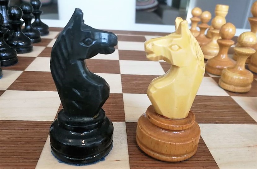
The knights of this set are magnificent. The standard Staunton S-shaped spine has been eschewed in favor of the Soviet C-shaped spine and V-shaped chest. While the carving is detailed, it depicts not the horse of the Elgin Marbles, but a highly expressive stylized horse with exaggerated eyes and over-sized mouth gaping open to bite its foe with its large and finely detailed teeth. Its forward-perked ears tell us the horse is at heightened alert, focused on the enemy to its front. By contrast, the ears of the Staunton’s Elgin Marble knight are pinned back. The sweeping side mane is beautifully carved, and the mane carvings along the spine foretell those found on the knights of the early 1940 Barrel Rook set.
The 1930s Artel Kultsport Ferocious Knight Set embodies the high production standards, creativity in design, and Modernist elements of Soviet artel sets of the era. Its fierce knight perhaps symbolizes the spirit to attack the future, the past, and enemies of the State both foreign and domestic.
Originally classified “Grandmaster 2” as one of four “Grandmaster” sets by Portuguese collector and historian Arlindo Vieira, the “Bronstein” name was added by American collector Mike John Ladzinski based on a 1968 photo of Bronstein and Tal playing with such pieces.
The GM2 sets were mass produced to meet an immense demand for sets among the vast chess-playing Soviet public.Shakhmaty v SSSR, 9/1962, at 278-279. Their design is quintessentially Soviet. It incorporates large, bulbous bases, curving up to concave stems, which trumpet into the pedestals upon which the crowns and miters perch. The bulbous bases are echoed in the large, rounded bases of the king’s crown and bishop’s onion-shaped miter, which itself reflects the shape of orthodox church domes. Large proletarian pawns reflect the importance of the working class to socialist ideology. CV-shaped Knights are carved in the distinct manner of the sixties. The following 1950s-early 1960s version has 105 mm kings and original dark blue cloth bottoms.
c. 1960 GM2 Pieces. Note the large wooden knights and the wooden finials. Chuck Grau Collection, photo.c. 1960 GM2 Pieces. Note the large wooden knights and the wooden finials. Chuck Grau Collection, photo.
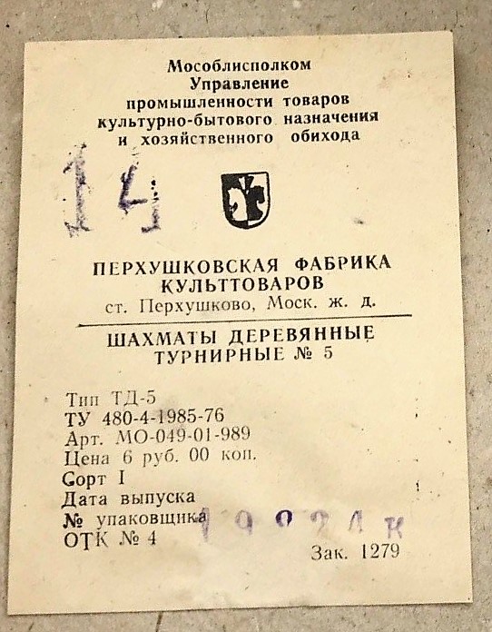
By 1967, the GM2 sets, manufactured in the Perkhushkovaya Factory of Cultural Goods in Moscow, began to sport plastic finials. Here is a set made in 1967 from the collection of Eduardo Bauza, together with its original cardboard box and sales receipt. Consistent with Soviet practice, the set lacks a distinct name, and is described by the box and receipt only as “Tournament Chess,” that is, a set suitable for tournament play.
1967 GM2 set. Eduardo Bauza Collection, photo.
By 1967 the set also saw some variation in the finials atop the kings. GM2 pieces with plastic, spike-shaped finials were used in the 1967 USSR Championship in Kharkiv, as shown by a photo of Uri Sakharov playing Lev Alburt in that event.
Uri Sakharov, Kharkiv, 1967. 0-1. Club Avangard photo.
Here are pieces similar to those in the Sakharov photo.
Here is a set from the seventies. It is slathered in uneven, taffy apple varnish. The knights are all wooden but the wooden finials have been replaced with plastic ones.
c. 1970s GM2 Pieces. Chuck Grau Collection, photo.
Some subtle changes to the design are evident. For example, the king of the 1970s set is taller, but with a narrower and less bulbous base. Its stem is shorter, but its crown is taller.
c. 1960 GM2 (left) vs. c. 1970 GM2 (R). Chuck Grau Collection, photo.c. 1960 GM2 (left) vs. c. 1970 GM2 (R). Chuck Grau Collection, photo.
The c. 1970s knight, however, is shorter and slimmer, its carving lacking details like the mane and the bit-hole found in the mouth of the c. 1960 knight. The curves of the c. 1970s knight are cruder, less smooth than those of the earlier knight.
By the 1980s, this “Tournament Chess” had been given a numerical designation “No. 5” to distinguish it from other sets also generically described as tournament sets. The label from the inside of a box of a 1985 set refers to it as “Wooden Tournament No. 5.”
As we will see with other mass-produced sets, production eventually was simplified with the use of less expensive plastic knights. Here is an example from the collection of collector John Moyes illustrating the plastic knight.
GM2 Plastic Knights. John Moyes Collection, photo.
The Grandmaster 2 Bronstein chess set served Soviet chess for decades. It was mass produced for a chess-playing public in need of thousands and thousands of sets. Its curvaceous design was quintessentially Soviet, even as it evolved to incorporate plastic parts and discard some detail in an effort to economize its production and make it more accessible to a Soviet public hungry for playing sets.
Today, I want to focus on one narrow topic raised by a contributor to Shakmatnyye Kollektsionery: what is a Grandmaster set and what are the differences between the different types of Grandmaster sets mentioned by collectors?
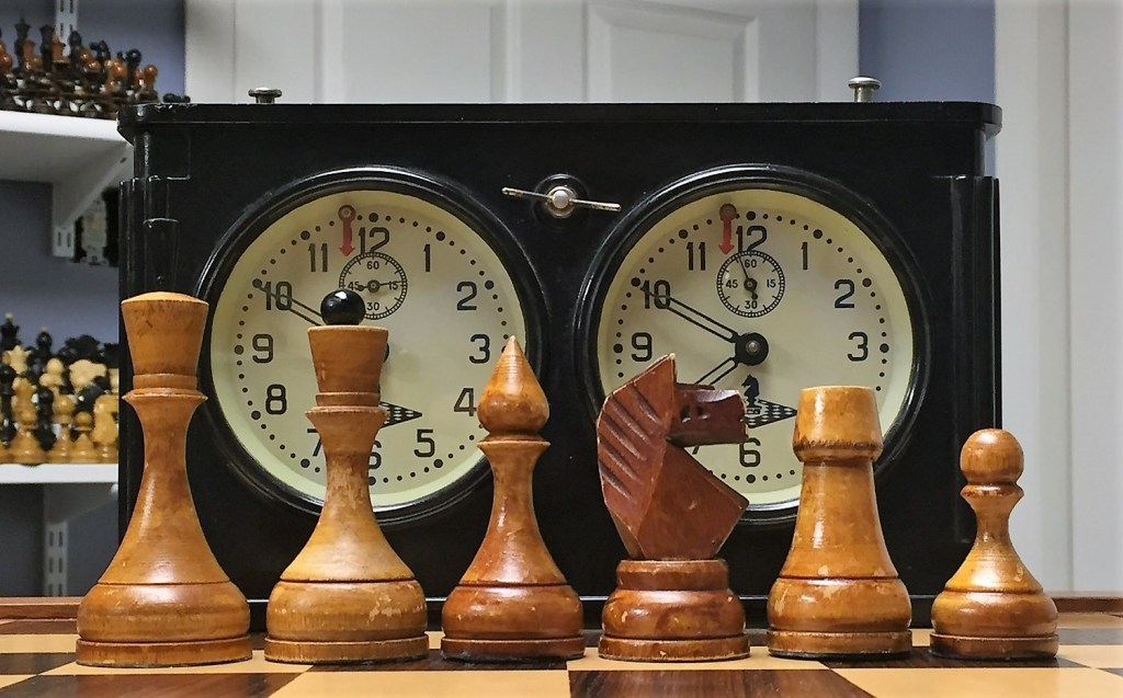
c. 1960 Grandmaster 1 Pieces. Chuck Grau Collection, photo.
A Grandmaster, or Grossmeister set is most generally a set that was used at the highest levels of Soviet chess, that is, by Grandmasters. Soviet sets typically did not have names, just as most Soviet consumer products did not have brand names. Instead, chess sets were described by functional categories.
Grandmaster sets were used by grandmasters. Tournament sets were for use generally in tournaments. Yunost sets were for students and youth. In Xadrez Memoria, Arlindo describes these GM, or Grandmaster, sets as:
Soviet pieces characteristic of many Clubs, competitions and even simple chess lovers that in a park, or Garden, anywhere in the former Soviet Union used to use them. Almost always these pieces were made with the respective folding board that also served as a box where they were kept (such “anemic” trays of 4.5 – 5cm square for pieces with a King base with 3.5-4 cm!… All of these pieces are very reasonable in size, with the KINGS walking 10-11 cm high… [T]hey are very different sets from each other and have been used in different times… .
Vieira designates each type of Grandmaster set with a number, 1-4, and dedicates one sub-section of his video to each GM type. He dates the GM1 in the seventies and eighties; the GM2 in the sixties through the eighties; the GM3 goes undated in both the video and the blog; The GM4 is undated, but he describes it as “the last version of this competitive set,” and shows it in use in the mid-eighties. The photographic record provides evidence that each of the four types indeed were used at the highest levels of Soviet Chess.
Within each GM category, there were a number of different sets sharing the same basic style. Some of the differences can be attributed to when or where they were produced, others by the intended audience. Thus each style had better made and finished types that were used at the high levels, and simplified versions that were mass marketed to the millions who played chess. Over the course of four articles, we will examine each of Arlindo’s four types.
Grandmaster 1 Pieces
Figure 1. 1960s Grandmaster 1, or GM1 Pieces, with reddish alcohol-based varnish finish. Chuck Grau Collection, photo.
Figures 1 and 2 present an example of a GM1 set from the 1960s. They are obviously well-used, not surprising insofar as Vieira describes the GM1 to have been “very popular in chess clubs.” In some ways, this set represents the end product of Soviet design. Reminiscent of a simplified BFII design, the GM1 incorporated what I call the Voronezh Curve, extending up from the base, forming a stem concave in shape, which blossoms out to form the pedestal upon which the piece signifiers rest.
The Royals’ crowns are bounded by a simple band, rather than the three-piece (two collars and a connecting area), with a simple trapezoidal shape, slightly domed at the top of the king. The coronets, miters, and turrets all lack details. The bishop’s miter has simplified the common Soviet onion dome to the shape of a tear. The knight is basically a slab with cuts across the vertical plane, and carvings cut into the wood. Its shape is an almost an exaggeration of the standard Soviet CV shape. All of the simplifications retain their Soviet character while facilitating mass production of the pieces. It is a simple design, perfect for mass production. The stem rises almost seamlessly from the base, forming a concave curve that trumpets out to serve as a pedestal, upon which the piece signifier–crown, coronet, miter, or ball–rests. The finials atop the king and queen are made of wood. In later versions, they are made of plastic. The queen’s coronet bears no crenellations. The knights are quite simple, comprising a slab with two angular cuts signifying the mane. The knight’s back forms a simple C-Curve, whereas the chest is cut to an angular V. The back of the ears continue the upward line of the back. The bishop’s miter is a simple tear-shape without a cut. The rook’s turret lacks merlons.
The factory produced chess sets (board and pieces), as well as chess boards and tables separately. Boards of at least four sizes – 20×20 cm, 30×30 cm, 40×40 cm, 45 x45 cm.
“GM1″ was produced in at least three sizes– for a board of 30cm, 40cm and 45cm.
From about 1960 to 1966, white figures and boards were covered with a red-brown varnish (most likely based on alcohol), from about 1967 they switched to a colorless nitrocellulose varnish.
In the 1970s, the finals began to be made plastic. In the “best” years, in the mid-70s, [the] factory produced up to 13,000 thousand sets per month.
Chain of renaming.
The artel “УтильПром/Utilprom” (in some sources “Утиль/Util”) was established in 1948.
In 1953 it was renamed “Промвторсырье/Promvtorsyrye” (in some sources “Промвторспрос/Promvtorspros”).
In 1957, it was renamed the “Ореджская промыслово кооперативная артель/Oredezh Promislovo-Kooperativny Artel”…
In 1960 was reorganized into the “Оредежский ДОЗ/ Oredezhsky DOZ.
The Oredezhsky DOZ existed with this name until April 1970, when the Oredezh and Luga plants were merged into “Лужский ДОК/Luzhsky DOK”.
In 1982, it was renamed “Лужский ЛДОК/Luzhsky LDOK.”
“Лужский ДОЗ/Luzhsky LDOK” Luga city, Leningrad region, has its own history.
In 1946, the “Лужский Мебельщик/ Luzhsky mebelschik” artel was established.
In 1956 it was renamed the “Лужская Мебельная фабрика / Luga Furniture Factory.”
In 1962 it was renamed the “Лужский ДОЗ/Luzhsky DOZ.” …
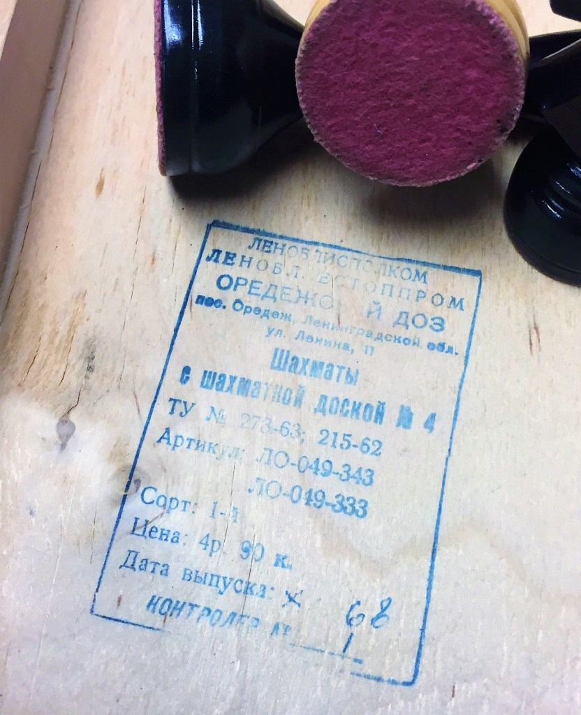
Figure 4 below shows a stamp found inside the board of a first quality set produced in 1968 in the Oredezh Wood Processing Factory, 11 Lenin Street, in Leningrad Oblast. The set included both the pieces and Board No. 4, as both are described and their product numbers given. The finials are all wood. The board’s squares are 4mm x 45mm.
Figure 4. Stamp inside board/box for GM1 produced in Oredezh. Chuck Grau Collection, photo.
The next photo, Figure 5, gives us a rare look inside a Soviet chess factory. It depicts a chess assembler foreman inspecting GM1 pieces in the Oredezh Wood Processing Factory.
Figure 5. Nina Yanovna Doroseva, Foreman of chess sets assemblers with GM1 pieces. Oredezh, 6 August 1979. Consistent with Sergey’s chronology, the pieces are finished in a clear varnish and should have plastic finials. Source: Sergey Kovalenko.
As Sergey described, the Orodezh Factory changed merged into to Luga, and began branding its sets with Luga’s distinctive round trademark, seen on the box in Figure 6. It is a late model set with all plastic finials.
Figure 6. Late Model GM1 pieces produced in Luga District, Leningrad Oblast. Source: Alexander Chelnikov.
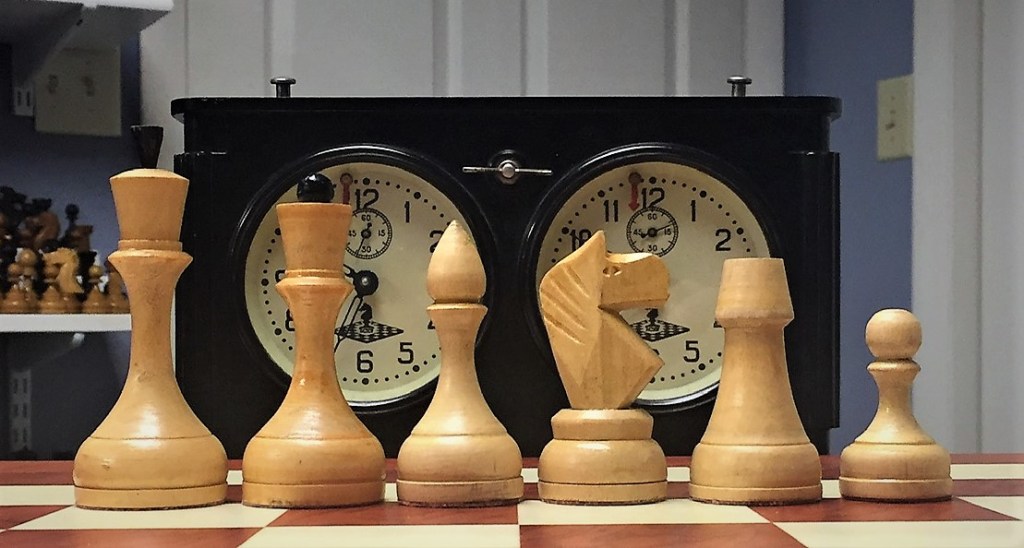
Figure 7 depicts the GM1 design in an analysis-sized set with kings of 76 mm. The finials are wooden, and the knights of an early pattern. They are consistent with those Sergey described as being for a 30 mm No. 3 board.
Figure 7. 1960s Analysis GM1 with 7.6 cm kings. Chuck Grau Collection, photo.
According to Arlindo Vieira, smaller sets like these were “very popular in schools and clubs, amateur tournaments.” It is perhaps a stretch to use a classification he coined to denote sets used by grandmasters in high level tournaments to describe a miniature set, but I use it to reference the design of the pieces rather than who used them.
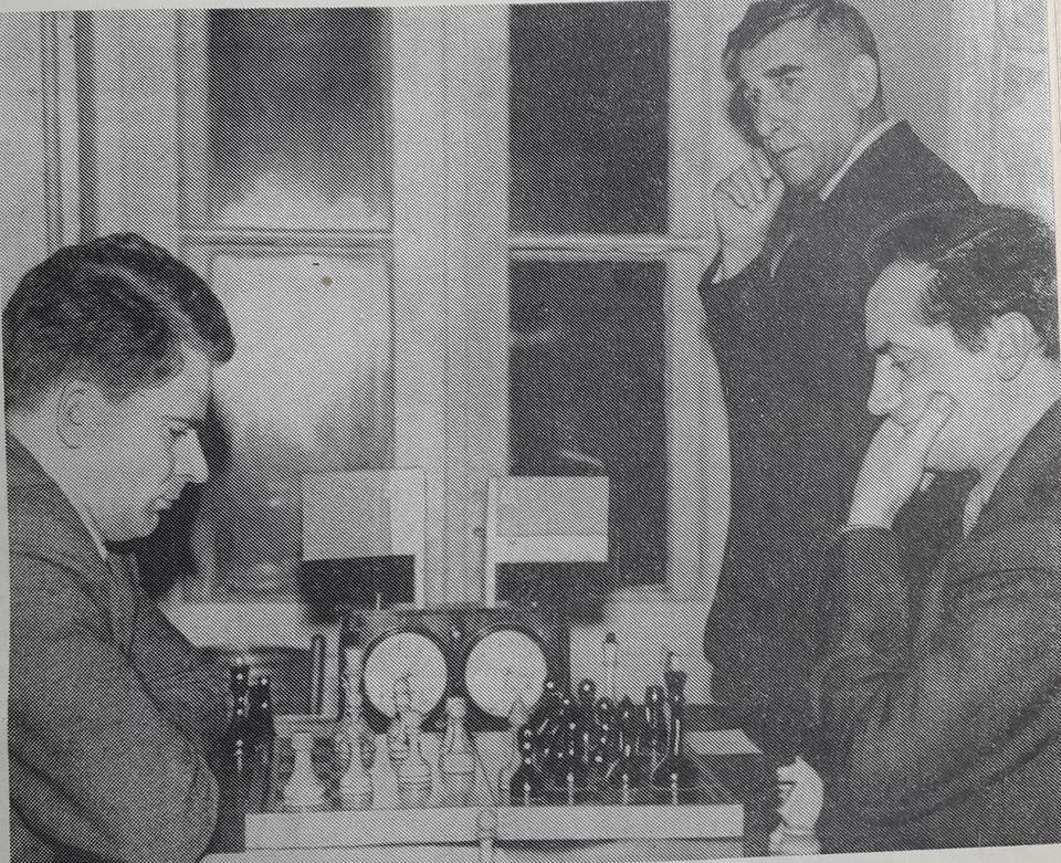
Figure 8. Spassky, Stein, and Bondarevsky with GM1 pieces (1966). Clear varnish, likely wooden finials. Photographer unknown.
As Sergey noted, the plant moved from red/brown varnish to a clear coat in 1967. Here are the pieces from the 1968 set shown in Figure 4.
Figure 9. Late 1960s GM1 Pieces with colorless nitrocellulose varnish. Chuck Grau Collection, photo.
Figure 10 . Late 1960s GM1 Pieces. Note the wooden finials. Chuck Grau Collection, photo.
As of this update, collector and graphic designer Eva Silvertant is working on a typology of GM1 knights. She has identified two other styles of GM1 knights. The first is similar to those shown in Figures 1, 2, 7, 9, and 10 from the Orodezh/Luga factory.
Figure 11. Source: GM1 Variant with Perkhushkovskaya Factory knights. Eva Silvertant.
The knights in this set appear to be very similar to those found in GM2 sets manufactured by the Perkhushkovskaya Factory of Cultural Goods, which suggests that these GM1 variants were produced there. More research is needed.
A second variant Eva has brought to our attention is what she aptly dubs the “Fox Head” Knights. She states that they were made by Luzsky Woodworking Enterprise, which Sergey had identified as the 1972 successor to Oredezhsky DOZ, renamed to essentially Eva’s form in 1982. Interestingly, these Fox Head knights appear similar to those Arlindo Vieira first posted in 2012. At this point, I am unaware of any cardboard boxes with identifying information relating to this variant.
One interesting variation of the basic GM1 design, seen in Figures 8 and 9 below, has been called the “Wolf Ear” or “Dropjaw” set in reference to its unique knights with their dropped jaws and their wolf-like ears. The knight’s wolf-like ears echo the sharp peak of the cleric’s tear-shaped miter. The rook’s lines also have been exaggerated over those of the standard GM1.
Figure 13. GM1 Wolf Ear Pieces. Chuck Grau Collection, photo.
Figure 14. GM1 Wolf Ear Pieces. Note the wooden finials. Chuck Grau Collection, photo.
The king stands 103 mm tall with a good-sized base of 45 mm. Lightly weighted. Like other GM1 sets, the Wolf Eared ones came in a variety of sizes. Steven Kong’s collection includes one with 112 mm kings. Ribnar Mazumdar’s collection also includes a specimen with 112 mm kings.
The Wolf-Ear set retains the general shape of the standard GM1, but is heightened and widened, the severity of the stem’s curve is reduced, the knight’s ears and mouth have been exaggerated, the king’s crown has been given a larger bulge on top, the king’s and queen’s pedestals have been heightened, the connection between pedestal and crown has been increased on the royals, the king’s and queen’s finials have been shortened and reduced in diameter respectively, and the sides of the rook’s turret have been given a curve.
Figure 15. A young Lev Aronian plays with a GM1 Dropjaw set c. 1991. Photographer unknown.
One significant problem with the Wolf-Ear set is that the kings and queens are difficult to distinguish. In fact, the Wolf-Ear queen looks very much like the king in other Soviet sets as well, compounding the problem. Another confusing design element is that the stem of the queen is longer than that of the king, connoting that she, not her liege, is the most important piece. Moreover, the unusual length of her stem results in her pedestal being above the kings, destroying the descending line of the pedestals that harmonizes the sight of the pieces on their initial squares and further confuses the connotation of value.
According to Sergey Kovalenko, the Wolf-Ear sets were manufactured in a correctional colony, Institution OI 92/9 in Makhachkala, DASSR (Dagestan). The colony later received the designation IK-2. The sets accompanied by the following labels were made in the 1980s.
Figure 16. GM1 Wolf-Ear set labels. Source: Sergey Kovalenko
Perhaps the unique profile of the Wolf-Ear knights derives from the Silver Wolf in the flag of the Avar Khanate of Dagestan.
This concludes our survey of Grandmaster 1 chess pieces. Next we will turn to another very Soviet design, the Grandmaster 2 pieces, sometimes called the Bronstein pieces owing to a photo of Bronstein and Tal playing with them.
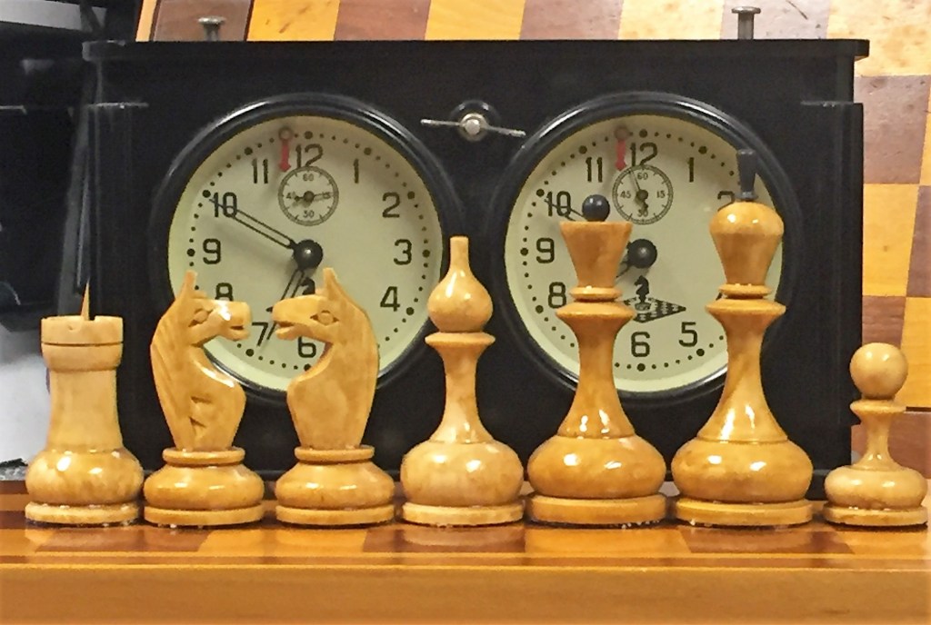
These impressive chess pieces are named after World Champion Vasily Smyslov (1921-2010), who is seen as a young man in a rare photo playing with a set of this design and size. Berlin artist and collector Porat Jacobson calls these pieces “revolutionary” because they reject the neoclassical column structure of Staunton and late Tsarist stems, replacing them with a trumpeted, dendriformic stem echoing modernist column designs.
Vasily Smyslov with pieces named after him. Dated 1937 according to Soviet chess historian Jorge Njegovic Drndak. Photographer unknown.
Porat Jacobson and I also believe Smyslov pieces appear in a 1927 photo of a game between Botvinnik and Panchenko.
Mikhail Botvinnik and Nil Panchenko, Leningrad 1927. See their game here. Photographer unknown.
What really sets these pieces apart are their trumpeted stems, which begin narrow at the base and widen as they rise, flaring at the top where they meet the pedestals upon which the King, Queen, Bishop, and Pawn signifiers rest. Unlike the Botvinnik-Flohr II and Voronezh designs, where the pedestals are a seamless continuation of the top of the stem’s concave curve, here they are distinct structural parts, delineated by a discernable seam.
Chuck Grau Collection, photo.
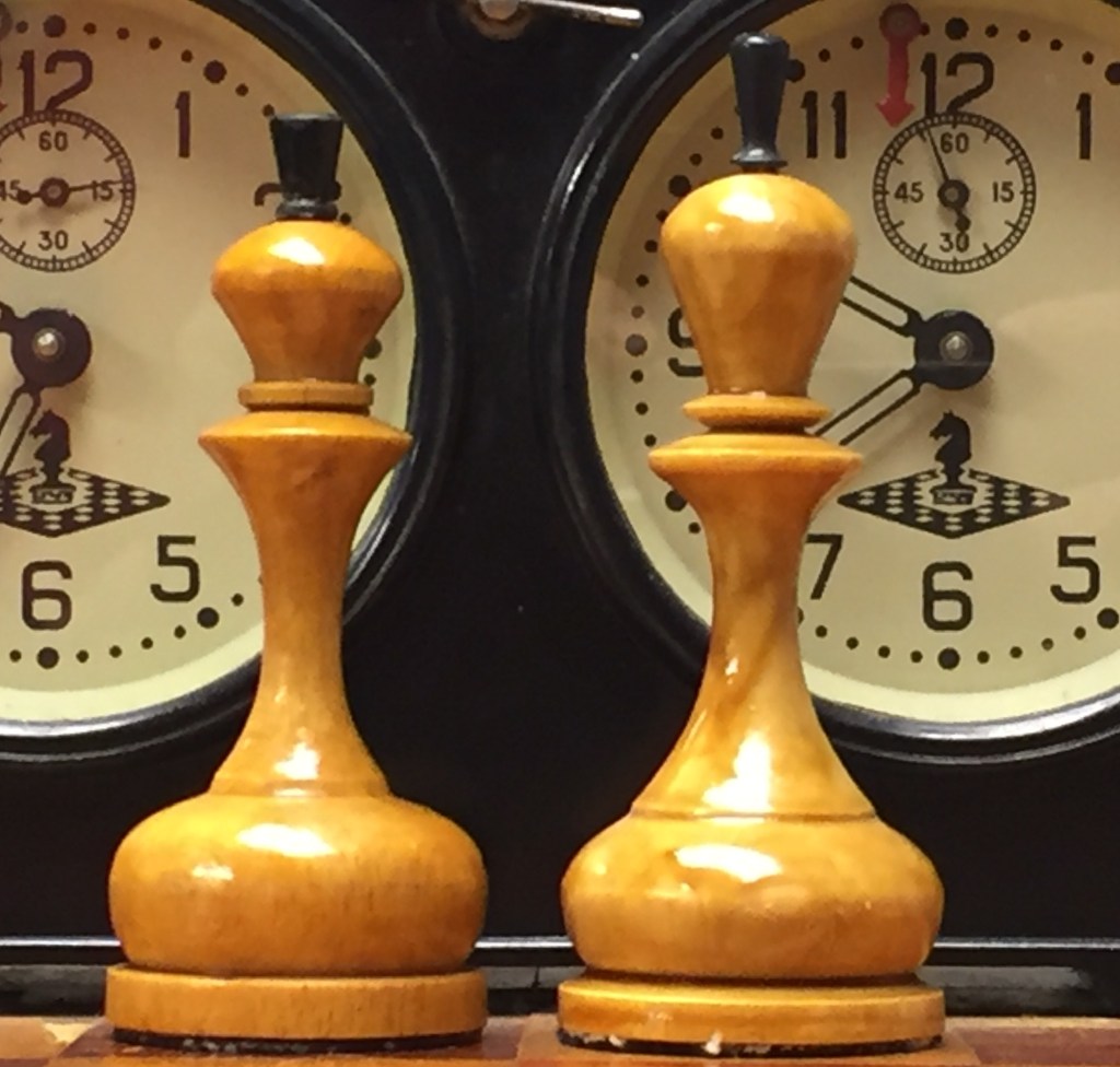
Visually, the royals and cleric signifiers rest within inverted isosceles triangles whose tips rest on the wide bases. Somehow the set still manages to convey an appearance of stability, perhaps due to the wide bases. The queen wears a unique, large globe-shaped finial perched on a stem above her coronet.
Chuck Grau Collection, photo.
The bishops wear massive miters topped with discs, perhaps a truncated form of globus crucigeras seen in the Laughing Knight pieces. Similar discs or spheroids sit atop the Baku clerics as well. The kings of my set are 11 cm tall with a base of 4 cm, and the pieces are reasonably well-weighted.
The design appears in other sizes and finishes. Here is a set from the Steven Kong collection with 9.5 cm kings. The “White” pieces are finished in red.
9.5 cm version in red. Steven Kong Collection, photo.
Here is an undated photograph of what appears to be the 9.5 cm. version in action.
The set’s counterintuitive stems remind me of the “dendriform” columns of the S.C. Johnson Administration Building in Racine, Wisconsin designed by Frank Lloyd Wright and opened in 1939. Those columns are only 9 inches in diameter at their base, but blossom to 18.5 feet in diameter at the top, and support ten times the structural load requirement.
Dendriform columns Frank Lloyd Wright designed for the S.C. Johnson Administration Building in Racine, Wisconsin. S.C. Johnson photo.
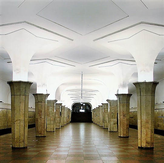
Dendriform columns were no stranger to Soviet design of the 1930s. They can be found in the Kropotkinskaya metro station in Moscow, completed in 1935 and designed by Alexey Dushkin and Ya. Likhtenberg. The station received international recognition and received the Stalin Prize for architecture and construction.
Dendriform Columns of the Kropotkinskaya Metro Station, Moscow. <a href=”http://NVO, CC BY-SA 3.0 Wiki Commons photo.
The Smyslov’s trumpeted, dendriformic stem seems to have appeared by at least 1927, seven years before the the convex stem/pedestal structure appeared in the Botvinnik Flohr II design. It’s not a stretch to think these pieces were a major step towards the structure that represents a major element of Soviet chess piece design.
The Smyslov’s dendriformic stem seems to appear in photos of the set used in the 1949 Moscow Championship, acquiring the name “Averbakh Set” by virtue of a photo of Yuri Averbakh playing with them in that event, and sets of the 1950s that seem to evolve or derive from the 1949 set. In this way the revolutionary elements of the Smyslov design have enjoyed a long and impactful life.
The state-sanctioned program of Political Chess begun by Alexander Ilyin-Genevsky and elaborated by Nikolai Krylenko was but one of several parallel projects aimed to promote socialism in the fledgling Soviet Union. Another such effort was Soviet Constructivism and its VKhUTEMAS Institute, an acronym for Vysshie Khudozhestvenno-Tekhnicheskie Masterskie (Higher State Artistic and Technical Studios), founded in 1920 by the merger of the Moscow School of Painting, Sculpture and Architecture and the Stroganov School of Applied Arts. Like the Bauhaus, it combined industry, architecture, design, and art under one roof. Among its famous faculty were Konstantin Melnikov (architect), Aleksandra Ekser (“color in space”), Alexander Rodchenko (construction), Nadezhda Udaltsova (“volume in space”), Varvara Stepanova (textiles), and Alexei Gan (graphic design). In Stepanova’s words, the Institute’s goal was to devise “methods for a conscious awareness of the demands imposed on us by new social conditions.” “Art is dead!” proclaimed Gan, “There is no room for it in the human work apparatus. Work, technique and organization!” J. Willette, Constructivism and the Avant Garde (2020).
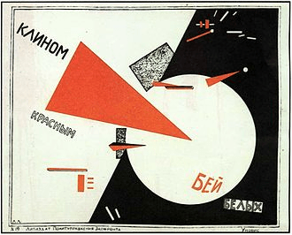
According to art historian Laura Hillegas, “The Constructivists sought to influence architecture, design, fashion, and all mass-produced objects. In place of painterly concerns with composition, Constructivists were interested in construction. Rather than emerging from an expressive impulse or an academic tradition, art was to be built.” Constructivism Brought the Russian Revolution to the Art World. Constructivist design employed pure geometric forms, linearity, symmetry, repetition, simple, sans-serif fonts, the dominance of red and black, and photomontage. FINSA, What is Russian Constructivism?
Many of these elements can be seen in El Lissitzky’s famous poster, Reds into Whites (1919):
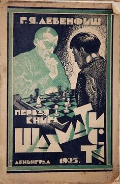
Constructivist elements abound in graphic art associated with Soviet chess of the 1920s and 1930s. Here is the cover of a popular chess book from 1925.
Grigory Levenfish, Book of a Beginner Chess Player (1925).
There are no known examples of a purely Constructivist Soviet chess set, but Rodchenko designed a chess table in 1925 for a Worker’s Club:
Rodchenko’s Constructivist Chess Table reproduction. He did not design the chess pieces. Wiki Commons photo.
It then should come as no surprise to find Constructivist elements appearing in Soviet chess set design. The constructivist influence is heavy in these small, unweighted pieces likely of the 1930s, whose kings stand a mere 63 mm tall.
Chuck Grau Collection, photo.
The bishops combine a sphere and a cone. The pawn is a sphere resting upon a stem that flows organically from the disc-shaped base unobstructed by a collar. The royals share a thick, hyperbolic, dendraformic stem, noticeably narrower at the bottom than at the top in defiance of neoclassical notions of “common sense,” where the bottoms of columns are “naturally” wider than their tops. The geometry of the royals’ stems is echoed in the dendraformic structure of the rook. “Common sense” is literally stood upon its head.
Chuck Grau Collection, photo.
The royals’ pedestals echo the form of the pawn’s base, their crowns attached by a double-collared connector. The king’s crown is composed of triangles and topped with a bullet-shaped finial. The queen’s crown inverts and repeats the pawn base structure, and is topped by a sphere. The only Staunton elements evident are the collared royal connectors and the relative sizes of the pieces.
Chuck Grau Collection, photo.
Pieces in this Constructivist-influenced design were made in at least two sizes. Here is the 65 mm king version compared side-by-side with a larger 85 mm version.
Alex Chelnokov Collection, photo.
The pieces of this set bear a remarkable resemblance to those found in a Constructivist flyer for the well-known 1925 Soviet film Chess Fever, starring World Champion Jose Raul Capablanca and other participants of the 1925 First Moscow International Chess Tournament, itself a manifestation of the Soviets’ program of Political Chess. The film, with English subtitles, can be viewed in its entirety here.
The pieces also appear in the photographic record from the 1930s. Here is a photo found by collector Sergey Kovalenko of Grandmaster Emeritus Vladimir Alatortsev (1909-1987) playing in a simultaneous exhibition with what seems to be the larger version of the set in the foreground.
Grandmaster Emeritus Vladimir Alatortsev. Source: Sergey Kovalenko.
My specimen of this design came inside a small wooden board/box similar to that appearing in the Alatortsev photo. The coordinates were added by a prior owner.
Constructivist-influenced pieces with board. Nikolay Filatov photo.
The inside of the box bears a stamp indicating that it was manufactured by the Moscow State Toy Factory, with a Moscow street address.
Chuck Grau Collection, photo. Alexander Chelnokov translation.
It’s from the Chess Fever flyer and Alatortsev photo that I date the set.
Many other Soviet sets bore Constructivist influences. I’ve already discussed the impact of modernism on the Botvinnik-Flohr II design here. It is a theme to which we will return.